
We live in an age of data. However, the sheer amount of information that we are bombarded with every day is huge, and keeping track of it is a challenge. Data visualization helps you keep track. Our brains are naturally designed to capture and process images faster than numbers or words. So why not use this characteristic to make complex amounts of data tangible? As we all know, a picture is worth a thousand words - or, as in this case, a thousand numbers.
Data visualization proves to be a particularly useful tool in the corporate context, where important strategic decisions are made on the basis of data. It makes huge amounts of data tangible and understandable, patterns and trends recognizable and tells stories about data sets that break down their complexity into the most important findings. In this way, it forms the basis of a data-driven organization.
Basics of data visualization
What is data visualization?
Data visualization transforms complex and confusing raw data into visual elements such as graphics, diagrams, plots or maps that present key findings in an intuitive and memorable way.
Data visualization also enables relationships, patterns and trends in the data to be identified and displayed, on the basis of which strategic decisions can be made, for example. This makes data easier to understand and interpret.
A simple example illustrates this: A report is required on the sales figures of product A and product B for the last month. A table with sober figures would contain all the information, but it would be difficult to recognize a trend. A simple bar chart, on the other hand, reveals this at a glance: Product A was the clear top seller. This visual representation is much easier to remember than a table of figures.
Data visualization tools can largely automate the process and improve data accuracy.

Our recommendation
Data visualization and data presentation
With the help of Power BI, you will learn how to create dashboards and visualizations and how to use them to effectively communicate and present correlations and track KPIs in your company.
This course shows you how to perform ad-hoc analyses using simple techniques in Excel and Power BI - without in-depth software knowledge.
Training: Data visualization and data presentation
Why is data visualization important?
Data visualization is not only important for data teams. Rather, all departments, from top management to individual employees, can benefit from its advantages:
Quick absorption of information and efficiency: Data visualization presents the most important points from the huge amount of data collected in such a way that they can be understood quickly. There is no need to sift through numbers. It becomes clear quickly and intuitively.
Patterns and trends: Data visualization enables the visual discovery of relationships, patterns and trends and their presentation - completely without text deserts.
Decision-making: Data visualization supports decision-making. It presents important findings from the data to stakeholders and thus helps them to make the right decisions.
Communicating data-based findings: Data visualization techniques can be used to communicate results more efficiently, as they are presented more clearly and intuitively than in long tables with values under cryptic abbreviations. Images tell stories and illustrate ideas that can be derived from data.
Basic data visualization techniques
We are already familiar with the most basic data visualization techniques from our everyday lives. These include tables, pie charts, line charts and bar charts. Roughly speaking, data visualization techniques can be divided into five areas:
| Technology | Explanation |
|---|---|
| In terms of time | Presentation of data over a certain period of time, identifies trends and patterns over time (e.g. line chart, timelines) |
| Hierarchical | Representation of data with a (natural) order or hierarchy (e.g. organization charts, family trees) |
| Network data | Representation of complex relationships between different types of data (e.g. scatter and bubble charts, word clouds) |
| Multidimensional | Presentation of two or more data variables in an overview (e.g. bar charts, histograms, pie charts) |
| Geodata visualization | Presentation of geographical data and patterns (e.g. heat maps, density maps, cartograms) |
Data visualization in practice
Use cases of data visualization
Data visualization saves time and leads to better decisions. This is why it is used in many different ways in companies, depending on the department. Because a better understanding of data helps in all areas.
In marketing and sales, data visualization helps to analyze and understand buying habits, demographic characteristics and customer feedback. Heatmaps of the company website provide information about user behavior and show, among other things, where visitors click most often or how far they scroll. Red areas indicate high activity, blue areas low activity. This makes it immediately clear which areas of the website are particularly interesting for user and where there is still potential for optimization.
The HR department uses data visualization to better understand and promote employees. Who takes part in further training? How satisfied are employees? How many employees leave the company? Visualized tendencies, trends and fluctuations can be quickly identified and correlated.
The Finance division, for example, relies on information on sales and profit development as well as cost structures for its financial reports. Graphically prepared, sales trends and cash flows can be displayed at a glance.
In production, data visualization, e.g. in a dashboard with real-time data, shows the capacity utilization of various machines. Colored traffic lights indicate where everything is running smoothly (green) and where there are problems (red). This allows production managers to intervene quickly if bottlenecks are imminent.

Our seminar recommendation
Data analysis and data visualization with Excel and Power BI
Learn how to use Excel and Power BI to make data-based decisions, create analyses and visualize results effectively - flexibly and practically. Register now and take your data analysis skills to the next level!
training: Data analysis and data visualization with Excel and Power BI
Best Practices: Effective data visualization
What makes a good data visualization?
The following steps can serve as a guide to creating effective data visualizations.
- Data basis: Visualizations are only as good as the data on which they are based. It must be ensured that the necessary data is available and accessible in the desired quality (up-to-date and correct).
- Audience: The target group and the purpose of the visualization should be taken into account. Is it about generating ideas, illustrating data or visual discovery? What kind of presentation does the target group want and what insights should be derived from it? Based on the audience, the goal for the visualization can be clearly defined.
- Visualization method: The appropriate method can now be selected. For example, the table below on visualization methods by purpose can be used as a guide.
- Visualization tool: There are a variety of visualization tools. Microsoft Excel is sufficient for smaller tasks. As soon as it becomes more complex, other tools are needed. Dedicated tools for data visualization are tableau, Zoho Analytics or Qlik Sense. Data visualization tools are also often built directly into business intelligence solutions. Examples of this are Microsoft Power BI or Amazon Quicksight.
- Maintain simplicity: If new information is added in the course of creation, it should only be included in the visualization with caution. The most important thing remains accessibility.
- Feedback: An iterative approach and regular feedback improve the data visualization and adapt it better to the needs of the target group.
Some visualization methods according to application purpose
The right visualization method is crucial for communicating data effectively and gaining insights. Different methods are suitable for different types of data and questions. Here is an overview of common visualization techniques and their typical areas of application:
| Visualization method | Application purpose |
|---|---|
| Line diagram | Trends and patterns over time |
| Area diagram | Time sequences, addition of line diagrams |
| Bar chart | E.g. rankings or comparison of different data |
| Pie chart | Representation of the composition of a whole, proportions between different data categories |
| Histogram | Representations of frequency distributions |
| Scatter plot | Representation of correlations or patterns between two variables |
| Bubble diagram | Representation of correlations or patterns between three or four variables |
| Heatmap | Display patterns and trends in large amounts of data |
| Treemaps | Comparison of categories by area size |
Examples of successful data visualization
One form of bar chart is the histogram, which is used to display frequency distributions. The histogram below, for example, provides an overview of the processing times for customer inquiries in a fictitious company.
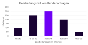
Example of a simple histogram for the processing time of customer inquiries
A heat map represents the frequency or intensity of certain data points using colors. Typically, warm colors (orange, red) are used for high values and cool colors (blue, green) for low values. The heat map is used for a variety of purposes, for example in weather reporting. Another popular example is the tracking and display of player movements in professional soccer. In the corporate context, it is used to visualize user behaviour (e.g. clicks, scrolling or mouse pointer movements) on websites. Some examples are listed here.
Successful data visualizations are about allowing stories to emerge from the figures. This is best achieved with visualizations that are surprising or turn the viewer into an actor, i.e. provide a certain degree of interactivity. Excellent examples of visualizations of this kind can be found here.
FAQ: Data visualization
What is data visualization?
Data visualization transforms complex and confusing raw data into visual elements such as graphics, diagrams, plots or maps that present the key findings in an intuitively clear and memorable way.
How does data visualization help to gain insights from data?
Diagrams, heat maps and the like make patterns, trends and anomalies easier to recognize. Data visualization helps to identify connections and relationships that might otherwise remain hidden.
What are the challenges of data visualization?
The first challenge is often the sheer volume of data available. Other challenges include oversimplification of the data, which can lead to the loss of important information, and human biases that influence data selection. There is also a risk of exaggeration or the presentation of false correlations.