Power BI Drillthrough Tutorial: Create interactive detail pages


Contents
Power BI Drillthrough - How to create interactive detail pages
Do you not only want to build beautiful overviews in Power BI, but also enable your users to dive directly into details with a click? Then the drill-through in Power BI is just right for you. In this tutorial, you will learn step by step how to create interactive detail pages, from the overview to the finished drill-through.
With the help of many informative screenshots, you will see how to create drill-through pages and add individual functions. You will also learn the difference between drillthrough, drilldown and tooltip , how to fix typical errors and optimize your dashboard with design and performance tips.
If you go through this tutorial, you will not only have a working example at the end, but you will understand exactly how drillthrough in Power BI makes your reports more interactive, tidier and more professional.
1. what is drillthrough in Power BI?
With the drill-through function in Power BI, you can easily delve deeper into your data. Right-click on a visualization to open another report page, which is automatically filtered to the selected context. This allows you to see detailed information on a specific category or key figure without having to click through many pages.
An example: If you click on the household appliances product category, a page opens with all the associated sub-categories, including turnover, sales volume or other relevant key figures.
Data basis: Contoso dataset
In order to understand the principle of Power BI Drillthrough, we work with the well-known Contoso dataset from Microsoft. This example model is ideal for practicing with real, practical data. You can easily download the dataset and recreate each step yourself. This will give you a good feel for how drill-through works in Power BI.
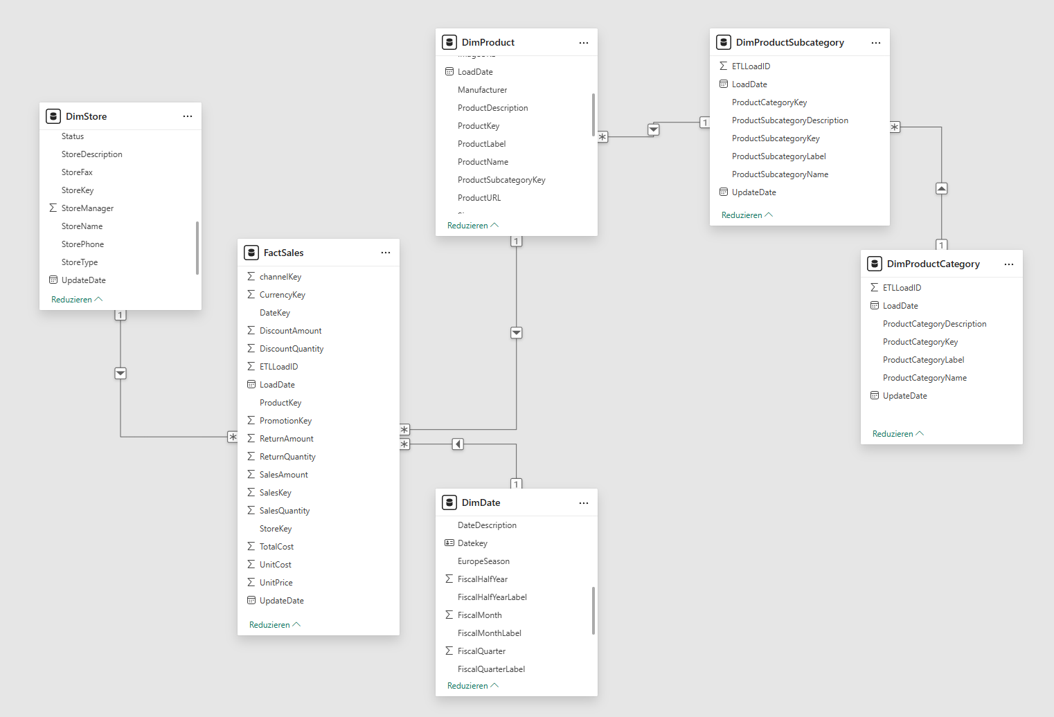
The Contoso data model consists of several linked tables:
- FactSales: contains sales, quantities and costs (key: ProductKey)
- DimProduct: contains product name, brand and category (key: ProductSubcategoryKey)
- DimProductSubcategory: lists the subcategories
- DimProductCategory: lists the main categories
- DimDate: provides calendar information such as month, quarter and year
The relationships of the data model behave as follows:
2. power BI drillthrough: step-by-step instructions
So that you can try out the Power BI Drillthrough yourself, we will go through the setup together. Step by step, you will first set up an overview page from which you can later jump to detailed views using the drillthrough .
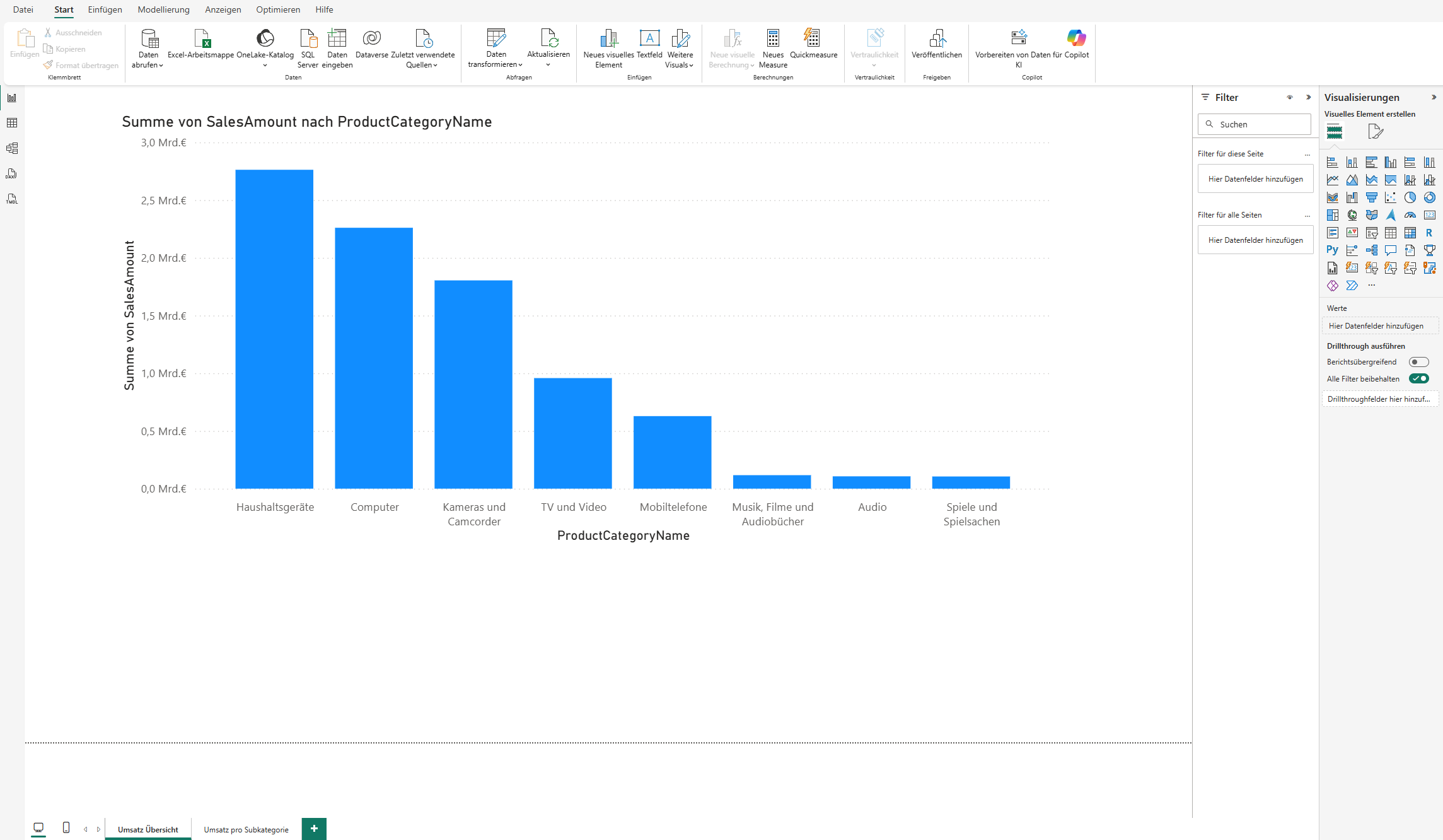
Step 1 - Creating the overview page
- Open Power BI Desktop.
- Create a new page and rename it Sales overview.
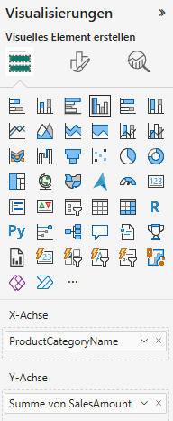
- Add the visualization Bar chart (grouped) add_
- X-axis: Select the column ProductCategoryName from the dimension table DimProductCategory .
- Y-axis: Select the SalesAmount column from the FactSales table.
This provides a simple overview of sales by product category. This forms the basis for diving deeper into individual areas later via drill-through in Power BI.
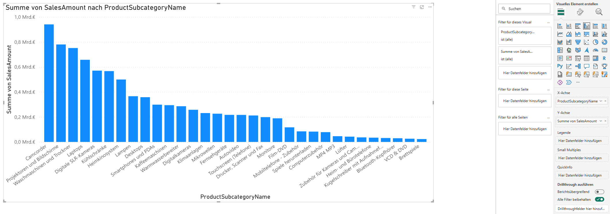
Step 2 - Creating the drill-through page
After you have created the overview page, the detailed view now follows. This page shows the data for a selected product category - it is therefore the target that you reach via the Power BI Drillthrough .
How to set up the drill-through page:
- Create a new page and rename it to Sales per subcategory.
- Add the visualization Bar chart (grouped) added:
- X-axis: Select the column ProductSubcategoryName from the dimension table DimProductSubcategory .
- Y-axis: Select the SalesAmount column from the FactSales table.
- To check whether the drillthrough works correctly, you can also insert the visualization card . To do this, use the ProductCategoryName field from the DimProductCategory dimension table.
You have now prepared the target page, which you can later access via drill-through in Power BI from your overview.

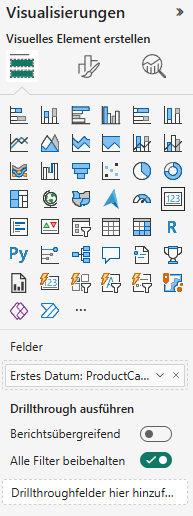
- Add drillthrough function:
In order for Power BI to know on which basis the drillthrough should be executed, you must define the corresponding field. To do this, open the Drillthrough section on the right-hand side of the page and drag the ProductCategoryName field from the DimProductCategory table into the Execute drillthrough area. This links your overview page to the detail page. As soon as you right-click on a product category later, Power BI automatically recognizes the context and opens the drillthrough page with the appropriate data.

The page is now defined as a drill-through target.
Step 3 - Testing
Now it gets exciting: You can check whether your Power BI Drillthrough is working as intended.
This is how you proceed:
- Switch back to the Sales overview page.
- Right-click on a category, for example household appliances, and select Perform drill-through → Sales per subcategory.
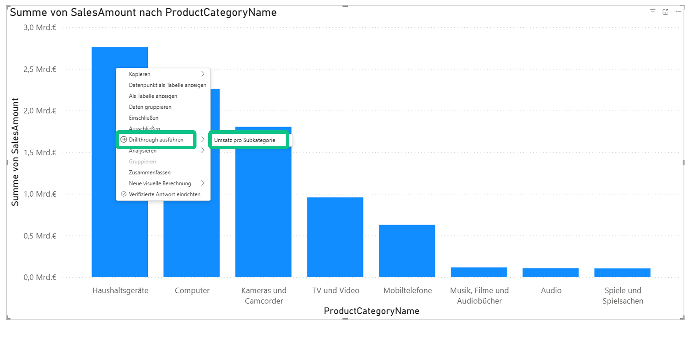
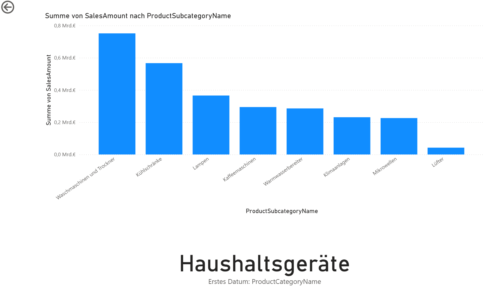
- Power BI now automatically opens the drill-through page and displays the filtered products and key figures of the selected category.
You have now successfully set up a functioning drill-through in Power BI. Your report now reacts dynamically to the selected context.
If you want to get even more out of the drillthrough in Power BI and learn more about it, you will find practical tips and useful information in the following sections.
Tip 1: Customize the back button
There is a back button so that users can navigate intuitively between pages. You can design this individually, for example in the colors of your corporate identity. This makes your drill-through report in Power BI not only look tidier, but also more professional.
This is how you proceed:
- Open the Sales per subcategory page and delete the standard Back arrow button (click and press Del).

- Go to Insert → Button → Back and place the button at the top left of the page.
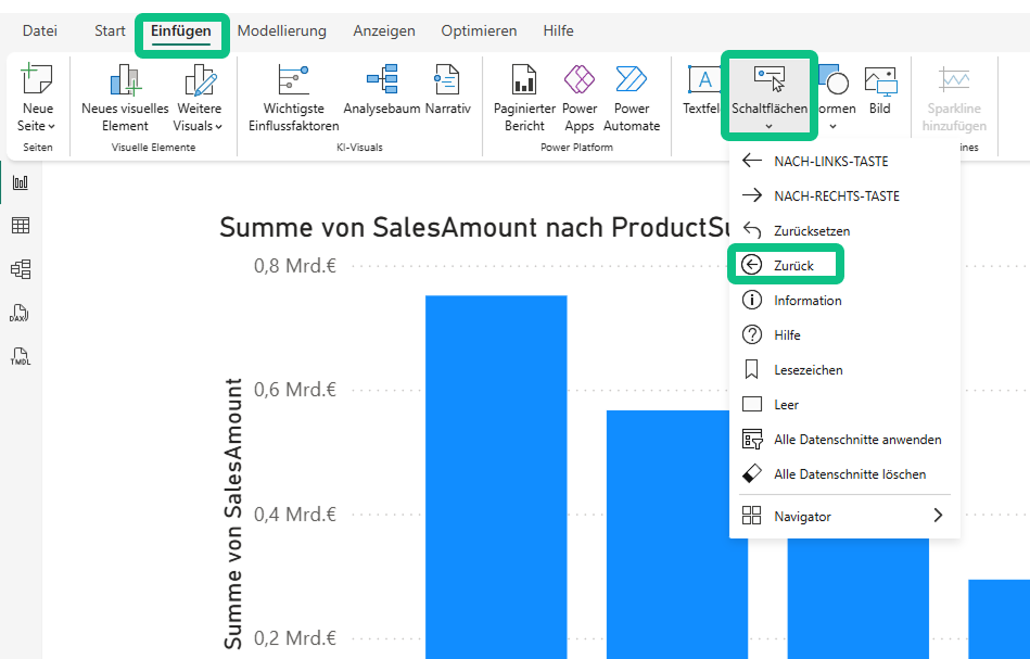
- Optionally, you can insert your own image(Insert → Image) and activate the Back type under Action .

Note: In Power BI Service, a single click is sufficient, whereas in Power BI Desktop a CTRL+click is required.
Tip 2: Hide detail page
If you want to prevent users from navigating directly to the detail page, you can simply hide it. This way, the report remains clear and can only be accessed via the Power BI drill-through.
This is how it works:
- Right-click on the Sales per subcategory page and select Hide page.
- In Power BI Desktop, a crossed-out eye symbol now appears next to the page name.
- In the Power BI Service, the page is then only accessible via drill-through .
This setting ensures that users experience the report exactly as you intended without accidentally jumping to the detail page.


Good to know: Difference between drillthrough, drilldown and tooltip
In Power BI in particular, terms such as drill-through, drill-down and tooltip are often confused. All three functions help you to view data from different perspectives. However, they differ significantly in their application.
Definition of terms:
- Drilldown: allows you to navigate within a visual along a hierarchy, for example year → quarter → month. You remain on the same page.
- Drillthrough: takes you to another report page that is automatically filtered to the selected context.
- Tooltip page: is a separate page that is displayed as an extended tooltip when you move the mouse over an element - a kind of mini-report with additional key figures.
Combining drill-down, drill-through and tooltip pages in Power BI creates a particularly interactive dashboard experience. This allows users to switch flexibly between depth of detail, context and quick information.
Common problems and troubleshooting
When working with Drillthrough in Power BI, problems can occur from time to time. The following tips will help you to quickly identify and rectify typical errors.
Problem: Drillthrough page remains empty
- Cause: There is no valid filter context or a relationship in the data model is missing.
- Solution: Check the relationships(DimProductCategory → DimProductSubcategory → DimProduct → FactSales) and make sure that the same field is used for the drill-through.
Problem: No drillthrough in the context menu
- Cause: The drillthrough field has not been configured on the target page or another field is being used on the source page.
- Solution: Use the same field (for example ProductCategoryName) both in the visual of the source page and in the drill-through area of the target page.
Problem: Filter does not work
- Cause: The cross filter direction or a page or visual filter overwrites the context.
- Solution: Leave the cross filter direction on single, check the filter area and remove possible conflicts.
Problem: Performance is slow
- Cause: Very large detailed tables, too many visuals or an inefficiently modeled data model.
- Solution: Reduce the column selection, use aggregations, limit the number of visuals and - if possible - keep the star scheme.
Best practices and design tips
The following best practices will help you to ensure that your Power BI report with drillthrough not only works technically, but also remains clear and performant:
- Clear visual hierarchy: structure is key. Build your report logically - from the main page to the detail page to a possible sub-page.
- Consistent design: Ensure consistent colors, fonts and spacing. A coherent appearance ensures a professional effect.
- Back button: Make sure the back button is always visible and in the same place, ideally at the top left. This allows users to find their way intuitively.
- Speaking field names: Use meaningful field names for the drill-through, for example product category or region, so that the context is immediately clear.
- Keep the focus: Limit yourself to one or two main KPIs per drill-through page. Too many key figures are distracting and make analysis more difficult.
- Optimize performance: Only load the required columns and remove superfluous fields. This improves the loading times and stability of your model.
Deepen your Power BI knowledge
The Power BI Drillthrough significantly increases the interactivity and user-friendliness of your reports. In the Contoso example used here, the technology enables you to switch from a clear product category page to a filtered detailed view with product-related key figures.
This function really comes into its own in management dashboards or self-service analyses: It creates clarity, saves clicks and makes data easier to understand. In combination with measures, buttons and tooltip pages, versatile, comprehensible reporting experiences are created that significantly increase the added value of your analyses.
If you would like to deepen your knowledge further, you will find two practical training courses that perfectly follow on from this tutorial:
Microsoft Power BI Data Analyst (PL-300)
Prepare yourself specifically for the PL-300 certification with an official Microsoft training course. You will learn how to model and transform data and create meaningful dashboards - supported by interactive exercises, Microsoft labs and feedback from certified trainers.
→ Ideal for anyone who uses Power BI professionally and wants to prove their knowledge with a recognized certification.
Power BI - The modern business intelligence tool
Start working with Power BI and learn how to integrate, cleanse and visualize data from different sources. Get to know the most important components - from the ETL process to dashboard creation - and discover how Power BI makes your day-to-day work in controlling and reporting more efficient.
→ Perfect for newcomers who want to gain a sound overview of the possibilities of modern data analysis.
With these courses, you lay the foundation not only to understand Power BI, but also to use it in a targeted manner, from the data source to the interactive dashboard.