Conditional Formatting Tutorial: Conditional Formatting in Power BI


Contents
Conditional Formatting in Power BI: How to Use Conditional Formatting Correctly
Conditional formatting in Power BI allows you to highlight important values and make your reports easier to understand. In this tutorial, you will learn step by step how to use conditional formatting with colors, symbols, and data bars, how to prepare data, and how to avoid common mistakes.
1. What is conditional formatting in Power BI?
Conditional formatting in Power BI allows colors, symbols, or data bars to be controlled automatically based on values or rules. This makes reports clearer and users correlations, trends, and outliers much more quickly. The technology makes information immediately visible and helps users make informed decisions.
Typical applications are as follows:
- Highlight high and low values with colors: You can mark high sales in green and low sales in red so that you can immediately see where action is needed.
- Mark deviations from targets: Symbols such as arrows, check marks, or warning signs show at a glance whether targets are being met.
- Enter ratios directly in tables: Data bars visualize the relative size of a value and provide intuitive orientation.
- Highlight individual key figures on maps: Color coding makes KPI values immediately understandable.
- Dynamically color charts: In column or bar charts, you control data colors using rules; in line charts, you adjust point or line colors based on conditions.
- Make KPI visuals more meaningful: colors and symbols illustrate goal achievement without additional text.
- Expand information in tooltips: Color indicators or small KPI symbols provide compact additional information when hovering over a visual.
Common forms of conditional formatting:
- Color logic such as red, yellow, and green for quick status assessment.
- Color scales from red to green to display values in a smooth gradient.
- Symbols such as arrows or warning signs for concise references to conditions or developments.
Note:
Wherever you see a small fx icon next to a color in the formatting area, you can apply conditional formatting.
2. Data source: Connect to Contoso database
To work with the sample data, use the ContosoRetailDW database. You must have already downloaded the Contoso BI Demo Dataset from Microsoft and restored it in SQL Server.
Connect to the Contoso database
- Open Power BI Desktop.
- From the Start menu, select Retrieve Data, then SQL Server.
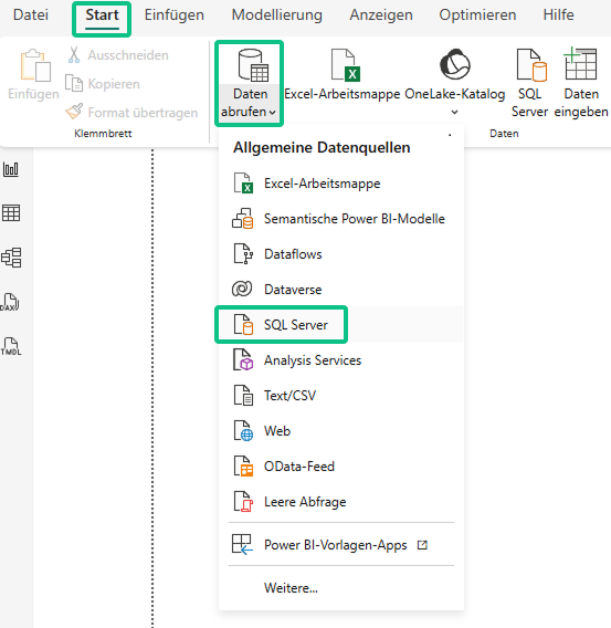
Power BI Desktop: "Start" ribbon with "Retrieve data" dialog open and SQL Server data source selected.
- Click Connect and enter your server name, for example, localhost\SQLEXPRESS.
- Enter ContosoRetailDW as the name under Database and use the Import connection type.

- Confirm with OK. The navigator will now show you all tables in the database.
Select relevant tables
In the Navigator, select the tables you want to load:
- FactSales
- DimStore
- DimDate
- DimProduct
- DimProductSubcategory
- DimProductCategory
- DimGeography
- DimCustomer
- DimChannel
Then click Load at the bottom to import the tables into your Power BI project.
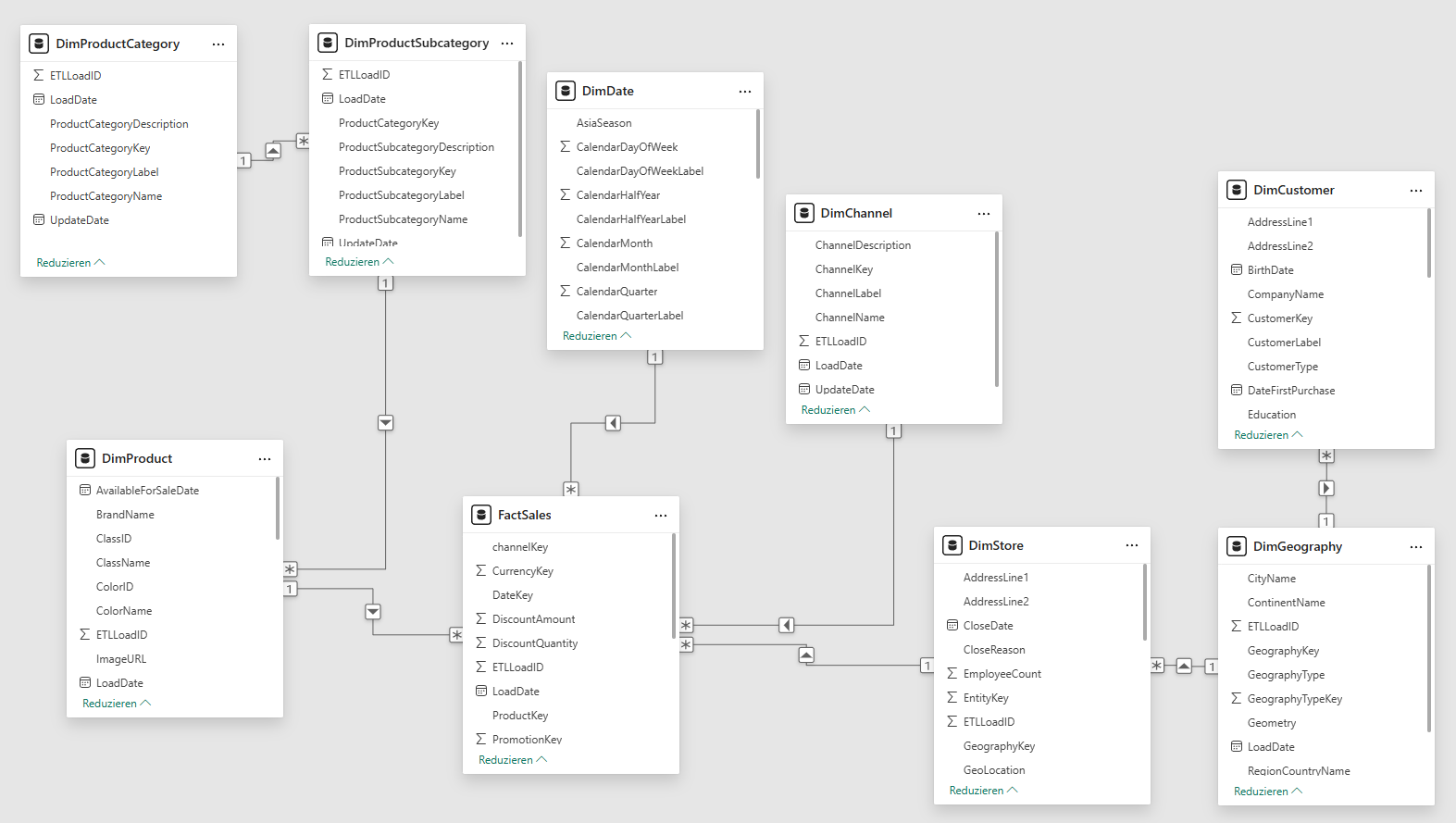
3. Check the data model
Before you start the analysis, make sure that the relationships between the loaded tables are correct. To do this, open the model view.
- Click on the model icon ( chart icon) on the left in Power BI Desktop.
- In the middle of the model, you can see FactSales as the central table, surrounded by the associated dimension tables.
- Check the existing relationships by clicking on the connection lines. Power BI will then show you which fields are linked to each other and in which direction the relationship runs.
This ensures that your data model is structured cleanly and that all calculations, filters, and visuals will function correctly later on.
4. Applying conditional formatting – step by step
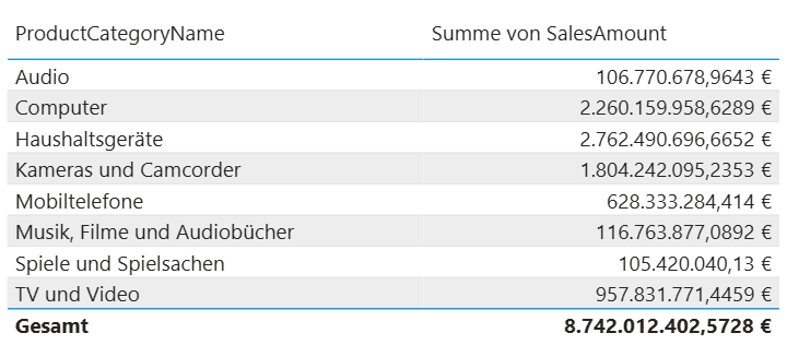
To begin with, create a simple table that shows you the sales figures for each product category. You will use this basis later to try out different types of conditional formatting.
Create table (basic)
- Open Power BI Desktop and switch to the report view.
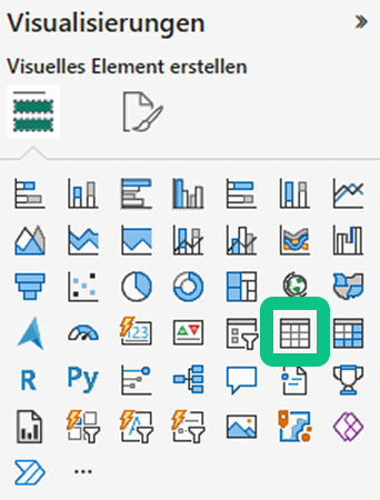
- Select the table icon in the Visualizations section.
Now drag the following into the Columns area:
- DimProductCategory [ProductCategoryName]
- FactSales[SalesAmount]
Power BI generates a table that shows you the product categories and the corresponding sales figures.
5. Conditional formatting – Example 1: Color scale for the background color of a column
Objective: Higher sales should be displayed more prominently in green, while lower sales should be displayed more prominently in red.
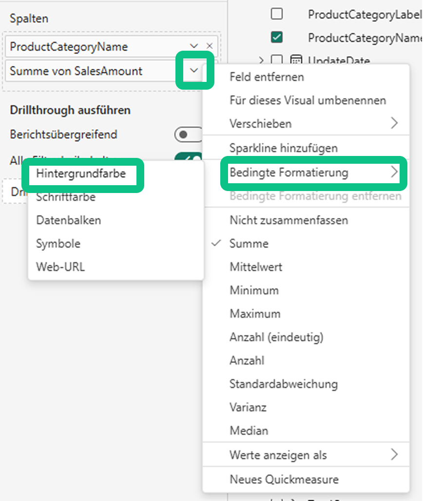
- Click on the table to select it.
- Search for the SalesAmount column in the field area on the right.
- Open the menu to the right of the SalesAmount field name using the small arrow (▼).
- Select Conditional Formatting → Background Color.
The Background Color dialog box opens.
- In the dialog box, select the Gradient option under Formatting style .
- Check under Field Value whether SalesAmount is used as the basis.
- Set "Type: Lowest value"in the Minimum section and select the color red.
- Set "Type: Maximum value"in the Maximum section and select the color green.
- Optionally, you can add a middle color, such as yellow, to make transitions appear smoother.
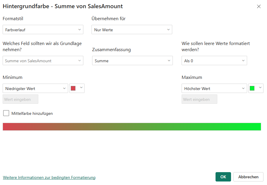
Click OK.
Result:
The sales cells automatically change color from red (low) to green (high):
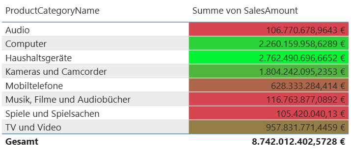
Ensure that SalesAmount is still selected as the base field and that the setting is applied to the values of SalesAmount.
Tip: If the color contrast is too strong, use softer colors or adjust the transparency in the format area.
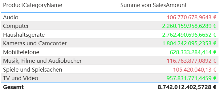
6. Conditional formatting – Example 2: Rules for text color (traffic light for sales)
Objective: Sales below $200,000,000 should be displayed in red, and sales above $200,000,000 in green.
- Select the table again.
- In the field area, open the drop-down menu for the SalesAmount column.
- Select Conditional Formatting → Font Color.
In the dialog box, select the Rules option under Format Style at the top:
- Set a first rule: if the value is less than or equal to 200 ,000,000, choose the color red.
- Add a new rule: If the value is greater than 200,000,000, choose the color green.
Ensure that SalesAmount is still selected as the base field and that the setting is applied to the values of SalesAmount .
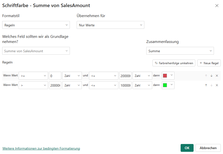
Click OK. Once you confirm, Power BI will color the text values depending on the sales amount.
Now the table displays the results as desired:
- low sales appear in red
- high sales appear green
Tip: If you combine this setting with background formatting , make sure that the colors provide sufficient contrast and that the values remain easy to read.
7. Conditional formatting – Example 3: Symbols in a table (status indicators)
Objective: In a table, a column with symbols should indicate whether a target has been achieved.
This is how you proceed:
- Select the table.
- In the field area, open the dropdown menu for the SalesAmount column.
- Select Conditional Formatting → Icons.
This opens the dialog box where you can define the symbol rules.
Now drag the following into the Columns area
In the Symbols dialog box, select Format Style → Rules.
Under Rules , you can now define appropriate conditions, such as different symbols for low, medium, or high values.
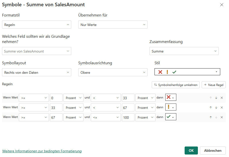
Confirm with OK.
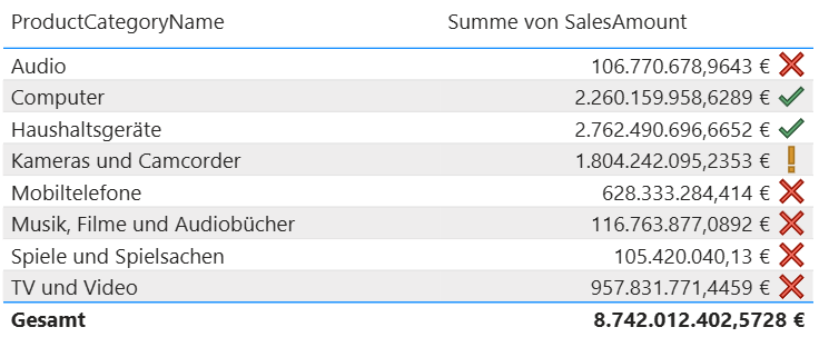
Result: Your table immediately displays visual status indicators, allowing users to recognize users rating of a value without having to interpret the numbers in detail.
8. Design tips for effective visuals with conditional formatting in Power BI
To ensure that your use of conditional formatting in Power BI not only works technically, but also looks good, there are a few basic design principles that can help. They ensure that your data is communicated accurately and that users understand users immediately. Clearly structured color and symbol rules make your reports more intuitive and support everyday decision-making.
- Traffic light logic for KPIs: Red stands for values below the target, yellow for values close to the target, and green for targets achieved. This logic is easy to understand and is particularly suitable for key performance indicators.
- Color scales for trends: A color gradient shows developments at a glance and enhances the effect of time series or comparative analyses.
- Symbols for status indicators: Arrows, check marks, or warning signs convey important information concisely and without additional explanation.
- Less is more: Clear, consistent coloring improves readability and prevents visual overload. Make sure that text and background provide sufficient contrast.
9. Avoid common mistakes—for better results with Conditional Formatting Power BI
Even though conditional formatting in Power BI is very flexible, small errors can cause visuals to appear unclear or difficult to interpret. These tips will help you ensure that your formatting remains both technically correct and visually appealing.
- Incorrect data type: If values are stored as text instead of numbers, rules will not function correctly. Check data types early on in the data model.
- Low color contrast: Colors that are too similar make interpretation difficult. Different shades must remain clearly distinguishable.
- Inconsistent color scales: Inconsistent color logic confuses users. Consistent color rules improve orientation.
- Too many rules: Highly complex formatting can affect performance and slow down rendering. Limit yourself to rules that deliver real added value.
10. Expand your Power BI expertise and apply it confidently
You now know how to use conditional formatting in Power BI in a targeted manner. This gives you a solid foundation for making your visualizations more effective and your analyses easier to understand.
If you want to further develop your Power BI skills, these two courses from Haufe Akademie will help you:
Microsoft Power BI - The training for getting started
This course is for you if you want to understand Power BI from the ground up. You will learn how to connect data, create models, customize visualizations, and publish dashboards. It's the ideal starting point for building your own reports with confidence.
Power BI: The modern business intelligence tool
This course is suitable if you want to delve deeper into data preparation, model logic, and interactive visualization. You will work with various data sources, learn about the ETL process, and develop dynamic reports that you can deploy in your company.
Both courses will help you expand your data skills and use Power BI even more efficiently in your everyday work.