Power BI Heatmap Tutorial: Create heatmaps step by step


Contents
Power BI heatmaps - how to visualize data impressively
In this tutorial, you will learn what heatmaps in Power BI are and how to create your own heatmaps in Power BI step by step, from data connection and design to practical tips for meaningful visualizations. You will also learn which heatmap types are available and how to use them specifically in your reports.
1. what is a heatmap in Power BI?
A heat map is a visual representation that makes data intensities visible through colors. The higher the value, the more intense the color. This allows you to immediately recognize patterns, trends and outliers in your data without the need for complicated diagrams.
In Power BI, heat maps help you to make large amounts of data comprehensible. You can quickly recognize correlations and intuitively compare important key figures. Whether you are analyzing sales, user activities or geographical distributions, a Power BI heatmap provides you with clear visual indications of where there are anomalies.
Typical areas of application are e.g:
- Sales per month and product category: Shows at a glance when and which product groups are particularly successful.
- Utilization per hour and weekday: Helps to identify peak times or quiet phases.
- Geographical data (e.g. customer density): Makes visible in which regions your company is particularly active.
2. what types of heat maps are available in Power BI?
In Power BI, there are three main types of heat maps that are used most frequently in practice. They cover almost all use cases, from classic table analysis to complex geographical or sensor-based representations.
A. Matrix heatmap (most frequently used)
The classic option: You use a matrix visualization and supplement it withconditional formatting. This highlights values in a table with color. This is ideal, for example, for:
- Time series (e.g. year, month, week)
- Product or KPI analyses
- Comparisons between categories
B. Geographical heat maps
This variant uses Azure Maps or ArcGIS to display data points spatially. Perfect if you:
- want to visualize locations, customers or events
- want to visualize point densities or regional differences
C. Heatmaps via custom visuals
In the Power BI Marketplace, you will find additional visuals that offer extended functions. These include, among others:
- Heatmap by MAQ Software
- Enhanced Heatmap
- Heatmap Chart (Deneb Template)
These visuals are particularly suitable for raster or pixel-based heat maps, such as temperature maps, IoT data or sensor measurements.
3. create heatmaps - step-by-step
Now it's time for the actual creation of heat maps in Power BI. In the following tutorial, we will use the ContosoRetailDW dataset from Microsoft. Together we will create two different heatmaps in Power BI, a matrix heatmap and one with Azure Maps-Visual.
Preparation: Connecting ContosoRetailDW as a data source
Before you create your first Power BI heatmap, you need a data source. In this tutorial, we will use the ContosoRetailDW dataset from Microsoft. How to integrate it into Power BI Desktop:
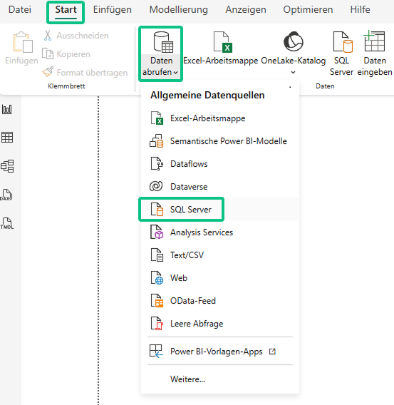
Step 1 - Establish a connection to the database:
- Open Power BI Desktop
- Click on: Start → Retrieve data → SQL Server
Enter your connection data in the dialog box:
- Server: your SQL server name
- Database: ContosoRetailDW
Example:

- Then click on OK.
Step 2 - Select tables:
Select the required tables, for example:
- FactSales
- DimDate
- DimProduct
- DimStore
- DimProductCategory
- DimProductSubcategory

- Click on Load to import the tables into Power BI.
- Optionally, you can check in the data model whether all links are set correctly:

Power BI heatmap example no. 1: Matrix heatmap (product category x year)
The first variant is the "classic" Power BI heatmap. It shows at a glance how your sales are developing by product category and year. To do this, you use a matrix visualization with conditional formatting.
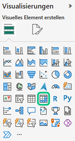
Step 1 - Add matrix visual:
- Select the Visual Matrix in the visualization area:
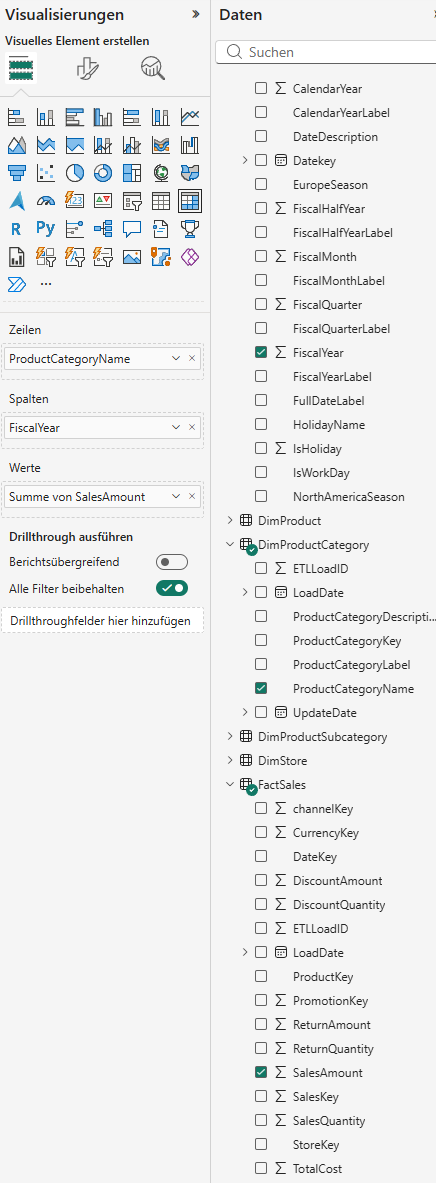
Enlarge the visual on the report page and fill in the fields as follows:
- Lines: DimProductCategory[ProductCategoryName]
- Columns: DimDate[FiscalYear
- Values: FactSales[SalesAmount]
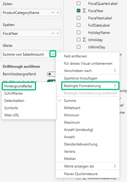
Step 2 - Activate conditional formatting - the actual heatmap:
- Click on the drop-down arrow next to SalesAmount in the field area
- Select Conditional formatting → Background color
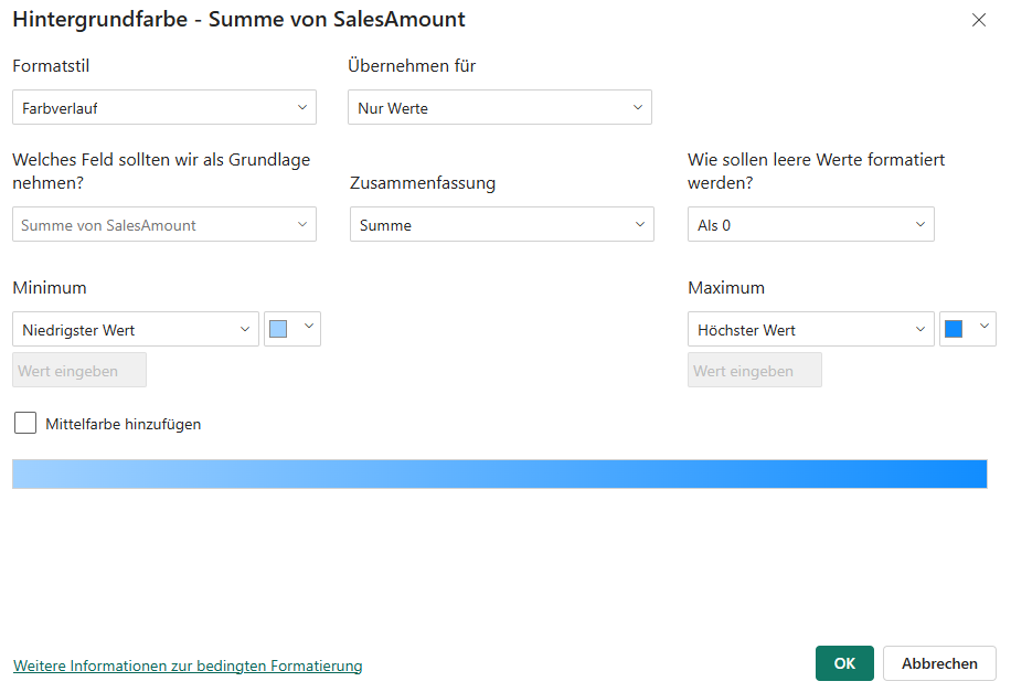
Define the color gradient in the dialog box:
- Format style: Color gradient
- Minimum: Lowest value (light), select color
- Maximum: Highest value (dark), select color
- Then click on OK.

Optional: Hide subtotals
If you only want to see the pure heatmap, you can deactivate row and column subtotals.
To do this, open the format settings of the matrix (brush symbol) and switch off the options Column subtotals and Row subtotals .

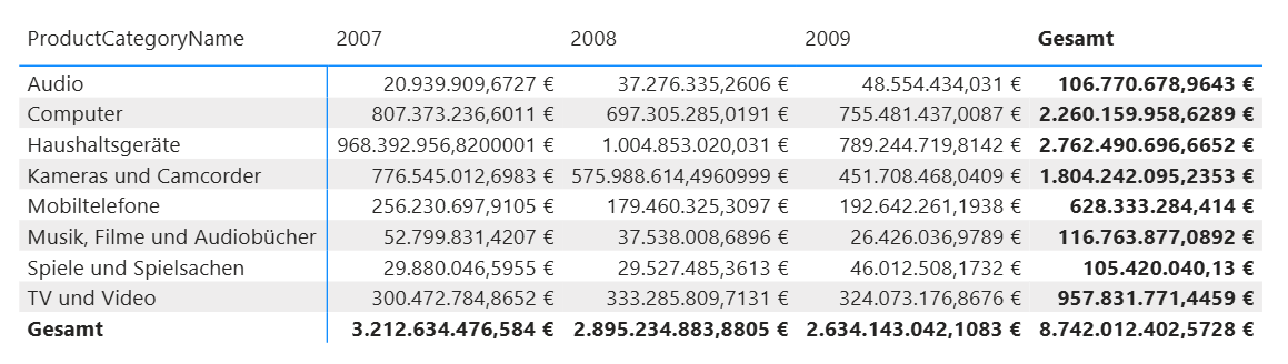
Result:

Optional: Hide numbers
If you only want to see the colored areas:
- Click again on the drop-down arrow at SalesAmount.
- Select Conditional formatting → Font color.
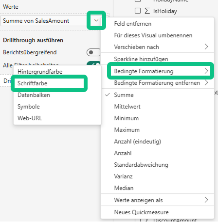
Now use the same colors as for the background.
Result:
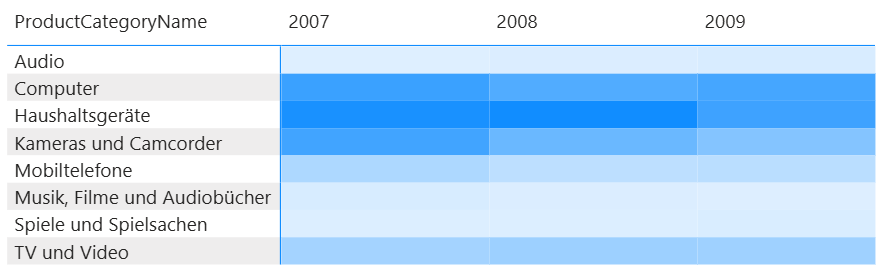
→ Dark-colored cells show categories and years with particularly high turnover, light-colored cells indicate lower turnover.
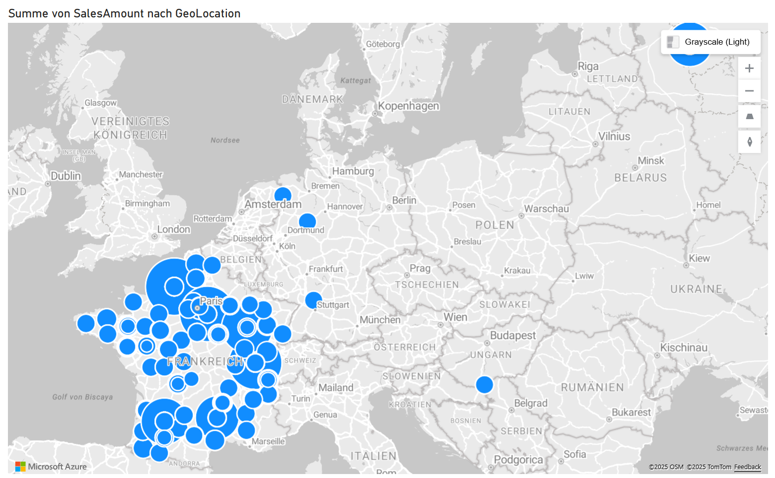
Power BI Heatmap Example No. 2 - Heatmap on a map with Azure Maps
The second variant shows your data geographically - perfect for seeing in which regions or cities you achieve particularly high sales. You can use the Azure Maps visual, which is already integrated in Power BI.
Step 1 - Select Azure Maps visual
- Select the Azure Maps visual in the visualization area:
Configure the visualization fields as follows:

Location: DimStore[GeoLocation]
Size: FactSales[SalesAmount]
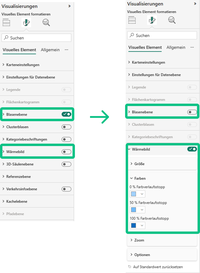
Step 2 - Activate display as thermal image
To turn the map into a real Power BI heatmap, open the format settings (brush symbol):
- Switch off the bubble level .
- Activate the thermal image level.
- Select the desired colors for your heatmap under Colors .
Result:
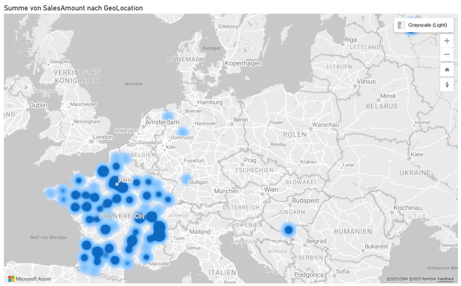
You can now see on the map where your company generates the highest sales. Intensive color areas mark regions with strong sales performance, lighter zones show lower sales.
4. design and best practices for Power BI heatmaps
To ensure that your Power BI heatmaps are not only correct but also meaningful, it is worth fine-tuning the design a little. Pay attention to a clear, understandable presentation and consistent color logic.
Tips for a convincing design:
- Use a uniform color scale: Use a clear logic, for example red = bad and green = good (or vice versa). This way, users interpret the colors intuitively.
- Add legend: Explains at a glance what the colors stand for. Particularly important for presentations or dashboards that are also used by other people.
- Consider accessibility: Choose colors with high contrast so that the heatmap remains legible even for color-blind users .
- Label cells: Numbers or values directly in the heatmap increase comprehensibility, especially for detailed analyses.
- Less is more: If you display too many categories or time periods, the heatmap loses its impact. It's better to reduce it to the most important dimensions.
Visual storytelling tip:
Heatmaps unfold their full effect when you combine them with other visuals, for example:
- KPI cards: Highlight key performance indicators and create context.
- Time series: Show trends and developments over longer periods of time.
- Slicer: Enable interactive filters so that users can set users priorities.
5. get more out of your data - your next step with Power BI
In this tutorial, you learned how to visualize data clearly with heatmaps in Power BI and gain real insights from large tables.
You know now,
- what a heat map is and what it is suitable for,
- what types of heat maps are available in Power BI,
- how to create a matrix heatmap and a geographic heatmap with Azure Maps step by step,
- and what you should pay attention to in design and practice to make your visualizations work.
With this knowledge, you are ideally prepared to use Power BI in your day-to-day work or to further expand your know-how.
If you want to understand Power BI even more comprehensively and deepen your skills, these courses from us are the ideal next step:
Microsoft Power BI - The training for getting started
Learn how to import and analyze data and transform it into meaningful dashboards. Perfect if you are just starting out with Power BI and want to master the basics.
Power BI: The modern business intelligence tool
Deepen your knowledge of data models, visualizations and the entire ETL process. Ideal for anyone who wants to use Power BI specifically in controlling or data analysis.
Both training courses show you how to use Power BI with confidence and how to get even more out of your data with professional dashboards.